



There's a specific kind of confusion that shows up once a product team gets good at running experiments. You ship the test. It "wins." The dashboard shows a green arrow. Six months later, retention hasn't moved, revenue looks the same, and someone in a leadership review asks the question nobody wants: what did all those experiments actually change?
The awkward silence in that room is almost always a measurement problem, not an execution problem. The team measured whether the button got more clicks. Nobody wired the button-click up to anything that mattered.
Why high experiment velocity doesn't guarantee results
A measurement architecture for product outcomes is the connective tissue between the thing you shipped and the business result you're claiming. It's the layer that says: this experiment moves this input metric, which feeds this outcome, which supports this roadmap bet. Miss that layer and your experiment program becomes a very expensive way to generate green arrows nobody can defend.
This is a systems piece — not "10 metrics every PM should track." The goal is to walk through how the whole measurement stack connects, where it breaks as you scale from one squad to eight, and what the guardrails look like when it's actually working.
The core problem: metrics live at three different altitudes and teams mix them up
Almost every measurement mess traces back to the same thing — people treat all numbers as if they're interchangeable. They aren't. Metrics operate at three altitudes, and confusing them is where the architecture collapses.
Eliminate product chaos and align your team.
Itemyly helps you plan, prioritize, and track every product milestone seamlessly.
- Centralized roadmap management
- Stakeholder collaboration
- Release tracking & analytics
No credit card required
Outcome metrics are the ones the business actually cares about. Retention, expansion revenue, activation rate, gross margin. Slow-moving, lagging, and almost never directly controllable by a single team in a single sprint.
Input metrics sit one level down. These are the things you genuinely believe drive the outcome. If activation is your outcome, an input might be "percentage of new accounts that complete their first meaningful action within 48 hours." You can influence these directly.
Experiment metrics are the local signals for a specific test. Click-through on a new onboarding step. Time-to-first-value for a redesigned flow. These are noisy, fast, and only meaningful in context.
The failure pattern is teams reporting experiment metrics as if they were outcomes. "Our new checkout screen increased add-to-cart by 12%" gets celebrated, but nobody checked whether add-to-cart actually correlates with completed purchases for this segment. In practice, this usually happens when the experiment owner and the outcome owner are different people who never talk.
Here's a simple way to see the three layers:
| Altitude | Example | Speed | Who owns it | Common misuse |
|---|---|---|---|---|
| Outcome | Net revenue retention | Quarterly | VP Product / GM | Blamed on one squad unfairly |
| Input | % accounts reaching "aha" in week 1 | Weekly | Squad lead | Ignored in favor of vanity metrics |
| Experiment | CTR on new tooltip | Daily | PM running the test | Reported as if it's an outcome |
The whole point of a measurement architecture is to make the arrows between these rows explicit — and testable. If you can't draw a defensible line from an experiment metric up to an outcome, you're guessing.
Building the hierarchy: work top-down, validate bottom-up
Most teams build metrics bottom-up. They instrument whatever's easy to track, then try to reverse-engineer a story about why it matters. That's backwards, and it produces dashboards full of numbers nobody acts on.
-
Start with the outcome you're accountable for. Pick one, maybe two per team. Not eight. "Increase paid conversion from trial" is a fine anchor.
-
Decompose it into input metrics you actually believe drive it. This is a hypothesis, not a fact. "Trials convert better when users invite a teammate in the first three days" — that's an input hypothesis you can test.
-
Define the experiment metrics that would move each input. If teammate invites drive conversion, an experiment on the invite prompt should move invite rate first, then conversion later.
-
Write down the assumed causal link explicitly. "We assume invite rate → activation → conversion." Naming the assumption is what lets you kill it later when the data disagrees.
Then validate bottom-up. Run the experiment, watch the input metric move, and check whether the outcome eventually follows. When it doesn't — and often it won't — you've learned something more valuable than a win. You've learned that one of your assumed links is broken.
Here's the workflow from top-down definition to bottom-up validation.
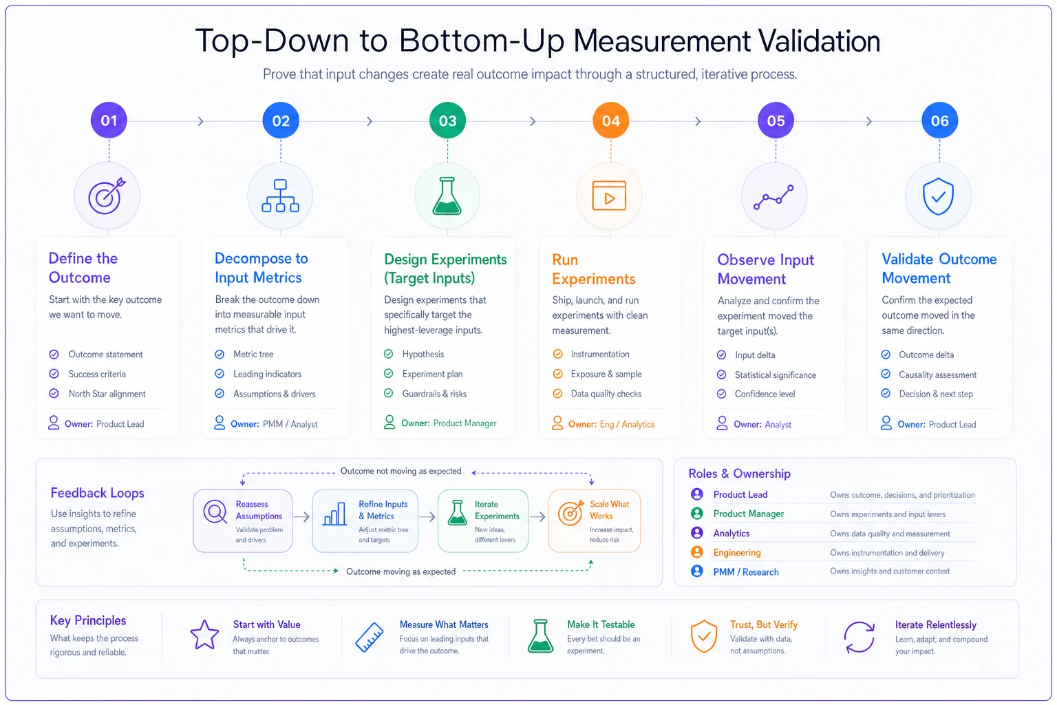
A pattern worth internalizing: an experiment that moves the input metric but not the outcome is not a success. It's a falsified hypothesis about your metric tree. Teams that celebrate the input movement and move on are the ones stuck wondering why nothing adds up at quarter-end.
What breaks at scale
With one squad, you can hold the whole metric tree in your head. Everyone's in the same standup. The moment you're at four, six, eight squads, the architecture starts failing in predictable ways.
Metric collisions. Two teams optimize the same input metric in opposite directions. One squad wants to reduce onboarding friction by removing steps; another is adding a verification step to reduce fraud. Both are "right." Without a shared tree showing who owns what, they discover the conflict in production.
Orphaned outcomes. Every input metric has an owner, but the outcome itself belongs to nobody specific. When retention dips, four teams point at each other. This is the most common scaling failure — inputs get owners, outcomes get committees, and committees don't move numbers.
Definition drift. "Active user" means one thing to the growth team and something else to the billing team. By the time both dashboards are wrong in different ways, the exec team stops trusting any of it. Definition drift is quiet and lethal — nobody notices until a board deck contradicts itself.
Experiment debt. Teams launch tests faster than they retire them. Feature flags pile up, half-analyzed experiments leak into the codebase, and nobody's sure which variant is live. If you've dealt with stale flags, you know how fast this compounds.
Coordinating measurement across squads shares a lot of the same failure modes as coordinating releases — the breakdown is always at the handoff, not in the individual work. The same discipline that makes cross-team launches predictable applies to measurement: shared definitions, explicit ownership, and a single source of truth everyone references.
Ownership guardrails: who's allowed to touch what
Metrics without ownership rot. But the wrong ownership model creates the collisions above. The guardrail that works is separating three distinct roles per metric — and yes, one person can hold more than one, but the roles stay distinct.
-
Definition owner — controls what the metric means. Only they can change the calculation. This kills definition drift.
-
Movement owner — accountable for whether the number goes the right direction. Usually a squad lead.
-
Data owner — accountable for whether the number is correct. Usually data eng or analytics.
A concrete guardrail checklist for every metric that lands on a dashboard:
-
[ ] Has exactly one definition owner named
-
[ ] Has a written, versioned definition (with the SQL or logic linked)
-
[ ] Sits somewhere explicit in the outcome → input → experiment tree
-
[ ] Has a stated "why we believe this drives the layer above it"
-
[ ] Has a data-quality check that runs automatically
-
[ ] Has a review date so it doesn't become a zombie metric
Make the movement owner visible on the dashboard card so execs can page someone if the metric breaks.
The rule worth pushing hardest: no metric goes on an exec dashboard until it has a movement owner who can be paged when it breaks. If nobody's accountable for it moving, it's decoration.
One more ownership trap — the outcome metric must have a single accountable owner even though many teams influence it. Shared accountability is no accountability. Someone has to own retention even if six squads touch it. Their job isn't to move it alone; it's to coordinate the squads whose inputs feed it.
Dashboard wireframes: three views, not one
The instinct to build one giant dashboard with everything is understandable and wrong. Different altitudes need different views, refreshed at different speeds, for different audiences.
View 1 — The outcome board (leadership, monthly/quarterly).
┌─────────────────────────────────────────────┐ │ OUTCOME: Net Revenue Retention [112%] ▲ │ │ Target: 115% Trend: 6-month sparkline │ ├─────────────────────────────────────────────┤ │ Contributing inputs (owner + status) │ │ • Expansion rate [J. Okafor] ▲ green │ │ • Logo churn [team-billing] ▼ red │ │ • Seat activation [team-growth] flat │ └─────────────────────────────────────────────┘
Keep it boring. One outcome, its inputs, owners, and direction. No experiment noise. Leadership should never see a tooltip CTR here.
View 2 — The input board (squad, weekly).
┌─────────────────────────────────────────────┐ │ INPUT: Seat activation (wk 1) [41%] │ │ Drives → NRR Owner: team-growth │ ├─────────────────────────────────────────────┤ │ Live experiments feeding this input: │ │ • EXP-204 invite-prompt +3.1% invite ▲ │ │ • EXP-211 checklist-v2 no sig. change │ │ Data-quality: last check 2h ago ✓ │ └─────────────────────────────────────────────┘
This is where squads live day to day. It shows the input, what it feeds upward, and which experiments are currently trying to move it.
View 3 — The experiment detail (PM, daily during a test).
Full stats: sample size, confidence, guardrail metrics, segment breakdowns. This view is disposable — it exists during the experiment and gets archived after, with a link back up to the input it was trying to move.
The wiring between views matters more than any single view. Every experiment card links up to an input; every input links up to an outcome. A PM should be able to click from "why is NRR flat" down to "which experiments are supposed to be helping and are they working." Without that vertical traceability, the three views are just three separate dashboards nobody reconciles.
Data-quality checklist: the layer everyone skips
You can have a perfect metric tree and beautiful dashboards, and it all collapses if the underlying data is quietly wrong. Data quality is the least glamorous part of this and the first to get cut when things get busy.
Run these checks automatically, not manually — because manual checks stop happening the week things get hectic:
-
Volume check — does today's event count sit within a sane range of the trailing average? A sudden 40% drop usually means a broken tracker, not a real behavior change.
-
Freshness check — when did this metric last update? A dashboard showing "green" on three-day-stale data is worse than showing nothing.
-
Definition consistency check — does "active user" resolve to the same underlying query everywhere it appears?
-
Null and duplicate check — are user IDs deduped? Are nulls handled the same way across the pipeline?
-
Segment sanity check — do your segments still sum to the total? When they stop summing, a filter broke somewhere.
Most "our metrics are wrong" fire drills are actually instrumentation drift — a release changed an event name, a filter, a default, and nobody updated the pipeline. The fix is coupling data-quality checks to your release process, so a deploy that breaks tracking fails loudly instead of silently poisoning next month's board deck.
If your experiment inputs are contaminated with noisy or mislabeled data, no amount of statistical rigor saves you. The discipline of filtering noisy inputs into clean, usable signal applies just as much to metrics as it does to feedback. Garbage in, confident-looking garbage out.
Feature → outcome worked examples
Abstract hierarchies are easy to nod along to and hard to actually build. Two worked examples of the full chain.
-
Feature shipped
An interactive setup checklist for new admins.
-
Experiment metric
Checklist completion rate. Moved from about 34% to roughly 52% in the treatment group.
-
Input metric
Week-1 seat activation (admins who invited at least two teammates and configured one integration). Rose from around 38% to 44%.
-
Outcome metric
Trial-to-paid conversion. Improved from roughly 19% to about 22% over the following two quarters.
The honest read: the checklist moved the experiment metric a lot, the input metric moderately, and the outcome modestly. That taper is normal and expected. If the experiment metric jumps 50% and the outcome doesn't budge at all, your assumed link is probably broken.
-
Feature shipped
A redesigned pricing page with a highlighted "most popular" tier.
-
Experiment metric
Clicks on the popular tier — up around 28%. Everyone celebrated.
-
Input metric
Paid signups from the pricing page — essentially flat.
-
Outcome metric
New MRR — unchanged.
The experiment "won" and delivered nothing. The redesign just redistributed clicks among people who were already going to buy. Without the input and outcome layers wired in, this ships as a success story and the team keeps redesigning pages that don't grow revenue. This is the exact failure the architecture exists to catch.
When this level of rigor makes sense — and when it's overkill
Not every team needs a full measurement architecture, and forcing one on a small team is its own kind of waste.
When it makes sense:
-
You have more than three or four squads running experiments in parallel.
-
Leadership keeps asking "did all that work move the number?" and you can't answer cleanly.
-
Two teams have optimized in conflicting directions at least once.
-
Your experiment velocity has outrun your ability to trace impact.
When it's a bad idea:
-
You're pre product-market fit and still figuring out what the outcome even is. Rigid metric trees calcify assumptions you should be tearing up weekly.
-
You have one squad. Just talk to each other.
-
You'd be building the architecture to look rigorous for a board deck rather than to actually make decisions. That's theater, and it collapses under the first hard question.
Who should hold off: early teams still hunting for their core loop. The overhead of maintaining definitions, owners, and quality checks isn't worth it when your fundamental hypotheses are changing faster than your dashboards can keep up. Get to a stable core loop first, then build the architecture around it.
A real scenario
A mid-sized B2B analytics company — around 40 people, three product squads — was running roughly 25–30 experiments a quarter. Their win rate looked great on paper; more than half of tests showed a "positive" result. But annual retention had been stuck near 84% for over a year, and nobody could explain the gap between "we win most experiments" and "nothing's improving."
The problem was straightforward once they mapped it. Every squad reported experiment-level metrics — clicks, opens, feature adoption — and none of them traced up to retention. Three separate teams were "improving activation" using three different definitions of the word. Two experiments had actively worked against each other for a full quarter without anyone noticing.
They spent about six weeks building the hierarchy: one accountable owner for retention, a small set of input metrics with named movement owners, and automated data-quality checks tied to their release pipeline. They also killed nine in-flight experiments that didn't map to any input worth moving.
The result over the next two quarters wasn't dramatic — retention moved from around 84% to roughly 88%. But the more meaningful change was decision quality. They cut experiment volume by about a third and stopped shipping "wins" that didn't matter. Leadership reviews got shorter because the answer to "did it work" was finally traceable. That traceability, more than the retention bump, was what actually changed how the team operated.
Bringing it together
A measurement architecture for product outcomes isn't a dashboard project. It's a discipline about the arrows — the explicit, testable links between what you ship, what you believe drives value, and what the business actually needs. Teams that skip the arrows end up with rooms full of green metrics and no idea which ones matter.
The pieces reinforce each other. The hierarchy gives you the tree. Ownership guardrails keep the tree honest. The three dashboard views serve the right altitude to the right audience. Data-quality checks make sure none of it is quietly built on broken pipelines. Pull one piece out and the others degrade — orphaned outcomes, drifting definitions, celebrated experiments that moved nothing.
Start small. Pick one outcome, decompose it into two or three input metrics you genuinely believe drive it, name owners, and wire your next handful of experiments into that tree. The first time an experiment "wins" but your outcome stays flat, you'll understand why this architecture exists — and you'll be glad you built it before the exec review, not during it.
Ready to elevate your product management?
Join 2,000+ product teams using Itemyly to accelerate delivery, improve alignment, and build better products.